skip to main |
skip to sidebar
Now this is an example of the type of architecture I love. Built in 1961, it is a typical example of early 60s school architecture. It is currently in its last year of use, and is being transitioned into a junior high school in the fall of 2008. I will post more pictures as I can find them, but my camera is having trouble uploading.  The main entrance to the building. Like the Middle School featured below, this entrance also features a cantilevered overhang, however this time it has a slight upward angle, to emphasize how it juts from the building.
  The bus entrance to the building is located in the background, and in the foreground is the 1972 addition to the building.
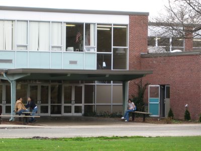 Close-up on the bus entrace. The doors to the right open into Cafeteria 2. The turquoise color of the door panels was originally the same color as the brown and light blue panels, however those latter panels have faded or been repainted over time. The overhang on this entrance slightly echoes that of the main entrance, but has a more "industrial" feel to it with the bare steel framing.
 Rear entrance into the stairwell of the 1972 addition.
 This is the view from inside the stairwell I mentioned above. Again, the tile and chrome staircases are typical throughout the building.
 And last but not least, an image of the history corridor, located in the 1972 addition. It has a more streamlined and modern look than the rest of the building, but still is very similar.
Although it may not be a great example of the type of modern school design I will tend to showcase, it shows the modern styling of late 1940s and early 1950s institutional buildings. On this post I'm showcasing the exterior of the building, but tomorrow I'll post some pictures of the interior as well. At a later date, when I get the time to organize all my other pictures, I'll get to demolition photos, too. If you look behind the tree, you can see the classroom windows. Glass blocks were very popular at the time, especially in schools, since they let in diffused light, a new concept back then. The general layout of the building shows that architecture was leaning away from the tall, intimidating schools of the past and moving towards more horizontally-oriented, low-slung designs.
 This entrance with its cantilevered overhang led to the auditorium lobby. Its design slightly looks like that of a movie theater to me, and doors leading from the lobby could be shut and locked so during evening performances, there was access to only the auditorium and balcony, along with restrooms.
 This architect's rendering of the 1969 addition to the building shows more of the outside of the building, since the tree is not there. It also shows the flagpole that stood until 2003.


 And last but not least, an image of the history corridor, located in the 1972 addition. It has a more streamlined and modern look than the rest of the building, but still is very similar.


